So a few days ago I said I’d be making a blog post that covers what I think are the important bits of Adium 1.0 if there was enough interest.
And there was indeed a lot of interest. So without making you folks wait any longer, here’s the highlights (note: These are what I thought the majority would be interested in that has not tried the beta). Please note that the fonts I use are not the default.
A few notes/thoughts/random ideas before I begin though. Or rather, maybe a little bit of a history lesson. Bah, either way. Basically the way we chose to do things a while back was to release .80 and then maintain just that for security/bugfixes and not much else. As many of you know an Adium release contains a lot of changes even if it’s just a security fix.
We also skipped .90 through .99. We might not have done that if we had to do it over again, but it’s mostly worked out for the better.
We also released .80 over a year ago. .89.1 Is basically over a year old with bugfixes, and no real new features.
It’s enough to make you go batty, or even turn into a large rectangle board game and then be split apart.
Like this:

Or maybe it makes your Mac blue to not know what’s going on with Adium in a meaningful way. Just maybe

So if you all wonder why we talk the beta up so much on the forums or irc, or why we tell some folks to try the beta to see if it resolves an issue, it’s for those and other reasons.
One final note. Contrary to popular belief, Adium X 1.0 will not have Voice/Video. This was noted here.
On to the show
The whole enchilada
I just thought this one wold be appropriate first. It’s in our built-in help on the front page, I think it’s pretty nice:

Contact List
So I think that the most viewed portions of the app are the Contact List and the.. well, you guess.
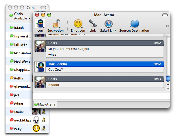
Anyhow, so pictures say more than words:

There are 2 big changes here.
1) The default contact list style has changed.
2) The toolbar has changed, like so:

There are 3 things to note about this area, those being the Name area (where Chris is), the Status, and the Image. All three are modifiable, right there. Mousing over the portions will making each apparent. Last I remember these are global settings and affect all accounts, but I may be wrong about that.
There is also 1 minor change to the contact list. Images will now be rounded if they are displayed inline. It’s not a large amount of rounding, but it takes some of the sharpness off of the images
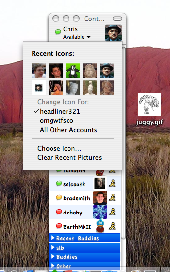
Here is what happens if you click the image in the toolbar

I think that covers the contact list pretty well, on to the…
Message View
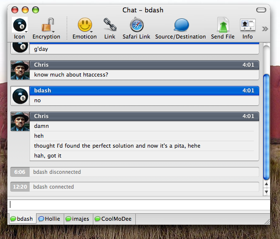
So here goes:

This is the stockholm style on the xtras. It’s interesting to note that both the message style and the contact list style were both from the xtras site. That’s right, used user generated styles to create part of the look for 1.0, and I think it’s really turned out well. Congrats folks, you all deserve it.
On to
Preferences
Other than the Contact List and Message Window, I think folks will look at Preferences the most.
So here’s the General Prefs:

There are a few things here, most of it hasn’t changed. Notables include the Evil Menu Duck checkbox moved here, a Hotkey preference got added here, and some other things got moved around.
One of the more apparent things about this screenshot is the fact that the toolbar icons had changed. Let’s look at them closer

Adam Betts did these, they look pretty snazzy.
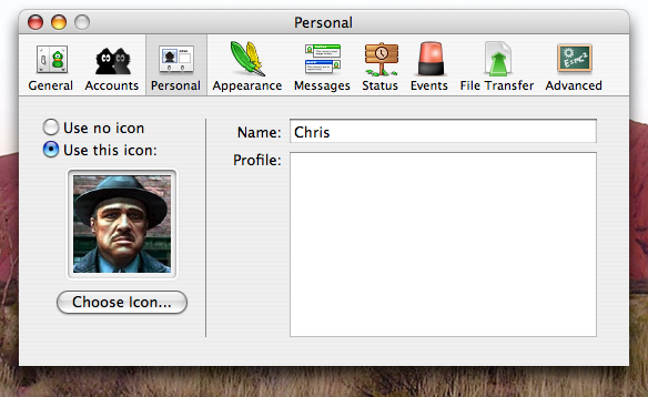
The last thing I’m going to post on here is the Personal Preferences.

The key thing here is that you can set your global Name (alias), Profile, and Icon. If you click Choose Icon, you can even set the image with an iSight.
For the cocoa developer, figure out what actually happens when you click on the Choose Icon button, you might chuckle quite a bit.
Well, that’s all I’m going to show. There’s lots of other changes, but these are the general ones. We all hope you folks will like them.
Oh, one last note. This is Beta 14, and things are subject to last minute changes.
